Designing the Shopping and Checkout Experience for E-commerce Stores: UI/UX Case Study

Introduction:
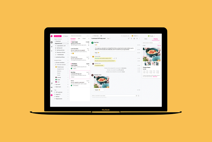
DelightChat is a shared inbox customer support tool for E-commerce and DTC brands. You can reply to your customers across all channels, view order data from Shopify at a glance, and collaborate with your team on customer issues. Our users could view and modify Shopify orders within the app but there was no option of browsing and shopping within the app without having to redirect to Shopify.
Role
I worked on the Research and UI/UX Design for the project.
Duration
1 month, March 2021
Understanding the problem.
DelightChat app did not have the option of browsing and shopping within the app.
Who are our users?
Our app is used by customer support agents of different E-commerce and DTC stores who talk to their customers daily. They resolve their queries, respond to their messages, etc. Most of our users handle more than 500 tickets every day (That’s a lot!!) from different channels, like Instagram, Email, Facebook, and sometimes even outside the app.
Identifying the pain points
After talking to our customers, we found a few pain points our users go through a daily basis-
👉🏼 The customers ask for product images while talking to our support agents. So in this case they have to move outside DelightChat, go to their website, take a screenshot and send it to chat.
👉🏼 Users wanted to search product catalogs, create carts and checkout links for their customers.

Pain Points of the user-
- The customer support agent is unable to perform all the actions within the app. She wants quick results so that she could select and send the product via chat.
- She has to move away from the app and move to another website- increases the time and reduces efficiency.
- She has to take screenshots of the product, dragging and dropping could make the process easier.
- Pre-sales is important to her, if the user likes a product, she would like to add the product to the cart and create a checkout link for them.
Defining the feature
I researched competitors to investigate similar websites currently in the market and took inspiration from particular features that I liked about each brand. I combined that research, to come up with the following key user stories for the feature:
For MVP
- Searching for a product. A user could either use the search option to look for a specific product, in the shopping tab. This flow would involve searching, discovering, and finding a product.
- Sending the product link to the customer. This flow would include sending product images, descriptions, etc to the customer.
For phase 2
- Adding products to the cart. On finding a product(s) the user likes, they may choose to add it to their customer’s cart.
- Creating a checkout link. On finding a product(s) the user likes, they may choose to add it to their customer’s cart and create a checkout link. This flow would involve adding to the cart, purchasing, and tracking the order.
Design
Analyzing the current designs-


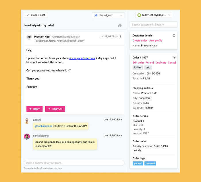
Current designs covered two things-
- Customer details which included their basic information, number of orders, total money spent, etc.
- Order details like the order number, all the orders placed, etc.
I wanted to include the shopping experience somewhere within these tabs because I wanted the support agent to be able to see customer & order details and search product catalogs in the same place.

Final Designs
Designing a shopping experience involves a lot of big modules with long user journeys. This made wire-framing an integral part of this project. We went through many iterations of every module before finalizing the designs. Here are some design challenges I tackled-
📌 I had limited space- how do I make sure the shopping feature works smoothly without causing cognitive overload to the user?

I divided the fourth panel into two tabs-
1) Orders tab - where you could see order details and customer details, same flow as old designs.
2) Shopping tab- Where you could browse the product catalog and add it to the cart.
📌 What is the most important part of the feature for a user?
As a user, my primary goals for this feature would be,
1)To be able to search for a product.
2) Select a product and browse the product.
3) Check the price, product description, and availability in other sizes, colors, etc.


📌 How to send products to the customer via chat?

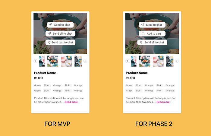
For MVP-

I included three options for my user. Upon hover on the product image, three options emerge-
- Send to chat- This will let the customer support agent send the particular product image to the customer.
- Send all to chat- If the customer wants all the photos of the product, the support agent can send all the product images to the customer.
- Send text to chat- This allows the support agent to send the product description to the users.
For phase 2-
For the second phase, I wanted my user to be able to add product(s) in the cart and create a check-out link for their customer to complete the loop.


Testimonials
Read the entire testimonial here.

💌 Let’s connect! I’d love to hear your feedback or questions.
I’m Shruti Chaturvedi, a Product Designer at DelightChat. I would love to connect with you on,
Twitter- https://twitter.com/shrutic98
Email- shrutichaturvedi98@gmail.com
